
Poble Espanyol
Catalan institution with two main objectives: to reflect its movement away from tourism toward culture and crafts, and to achieve a better relationship with the people of Barcelona
Services
Design, Creative Direction
Services
Design, Creative Direction
The Identity
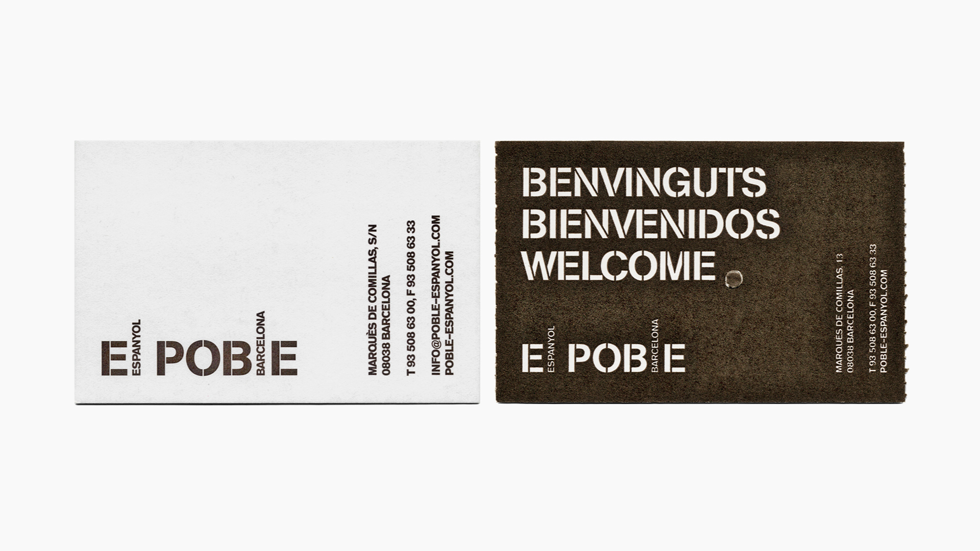
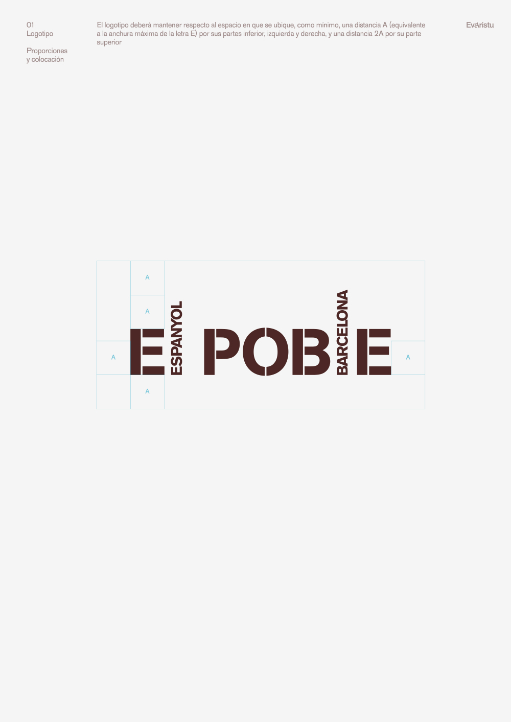
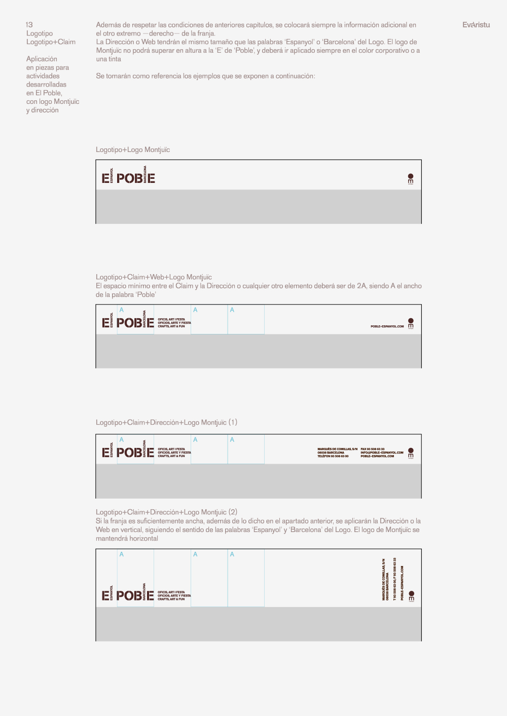
Hiding the word Espanyol (Spanish) and adding the word Barcelona in the name help to bring the brand closer to the people of Barcelona and also promoted the part of Poble (Village), more artisan than touristy
Hiding the word Espanyol (Spanish) and adding the word Barcelona in the name help to bring the brand closer to the people of Barcelona and also promoted the part of Poble (Village), more artisan than touristy
The Communication
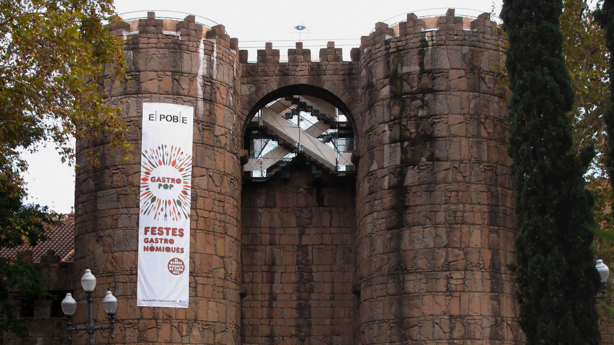
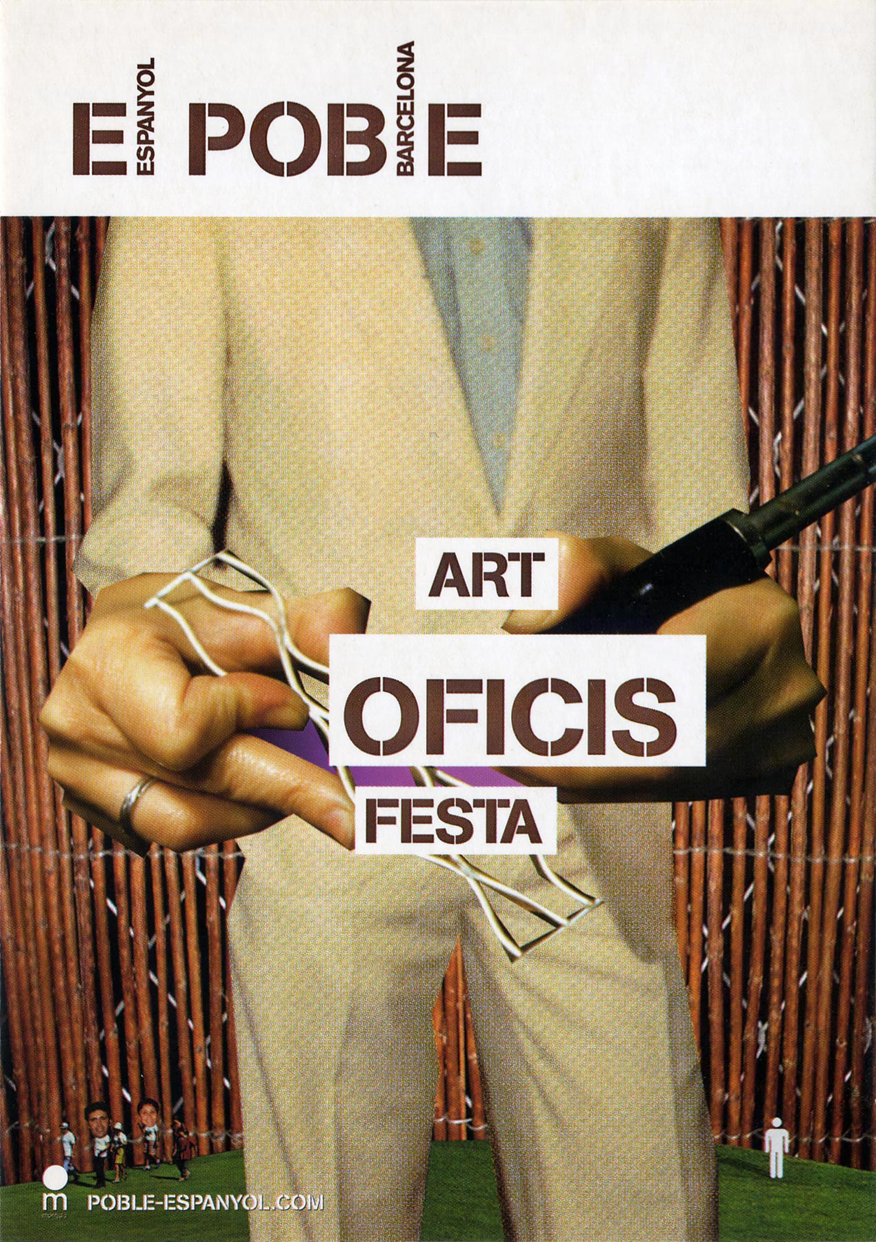
The entire offer is structured in three main areas: Art (which includes the Coca-Cola Foundation contemporary art collection), Crafts (for housing the largest craft center in Catalonia) and Fun (referring to the multitude of concerts and events taking place there)

The Anniversary
The institution is created after the Universal Exhibition of Barcelona in 1929 and this is the logo celebrating its 75 years, using the same graphic resources as the recently released visual identity

Company
Copywriting Eva Conesa, agency Evaristu, client Joan Abellá and Mónica Motje from Poble Espanyol
Spacetime
Barcelona, 2004
Categories
Identity, Logo, Guidelines, Communication, Campaign, Commerce
Related
Poble Espanyol Campaign