Mstake
Everybody knows that no one is perfect, but society seems to insist on its constant invitation: the perfect body, the perfect smile or the perfect blah blah blah
Mstake fights against perfection and its offer proudly shows error as a differential point, including its own products and limited editions for other brands, always with imperfection and a certain sense of humor
Services
Design, Creative Direction, Art Direction
Mstake fights against perfection and its offer proudly shows error as a differential point, including its own products and limited editions for other brands, always with imperfection and a certain sense of humor
Services
Design, Creative Direction, Art Direction
The Identity
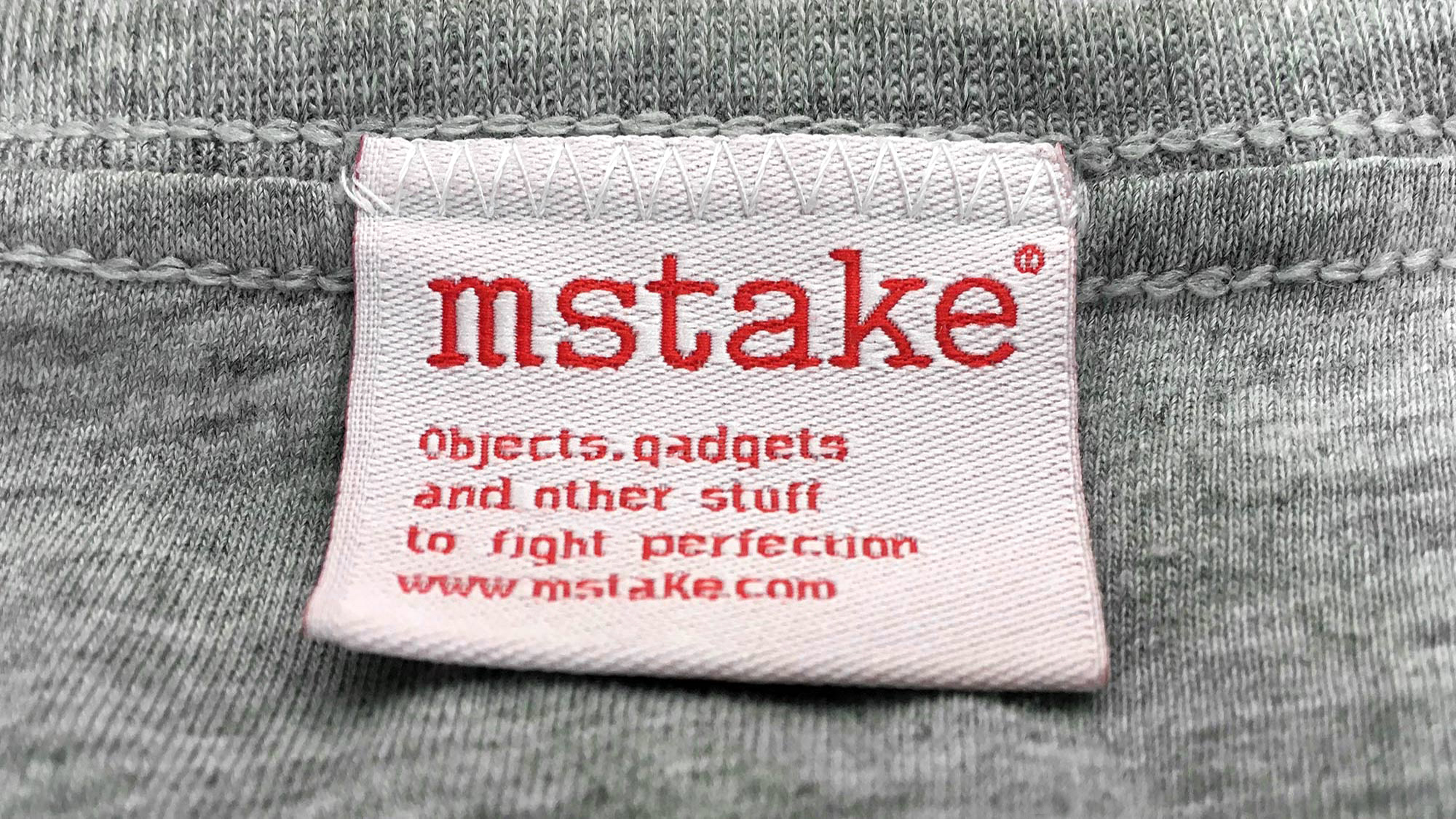
Mstakes are mistakes, but far from avoid them they are used to give personality to the communication pieces, as on the products or the logo: from teeshirts to labels, postcards or packs, there is always something wrong
Mstakes are mistakes, but far from avoid them they are used to give personality to the communication pieces, as on the products or the logo: from teeshirts to labels, postcards or packs, there is always something wrong

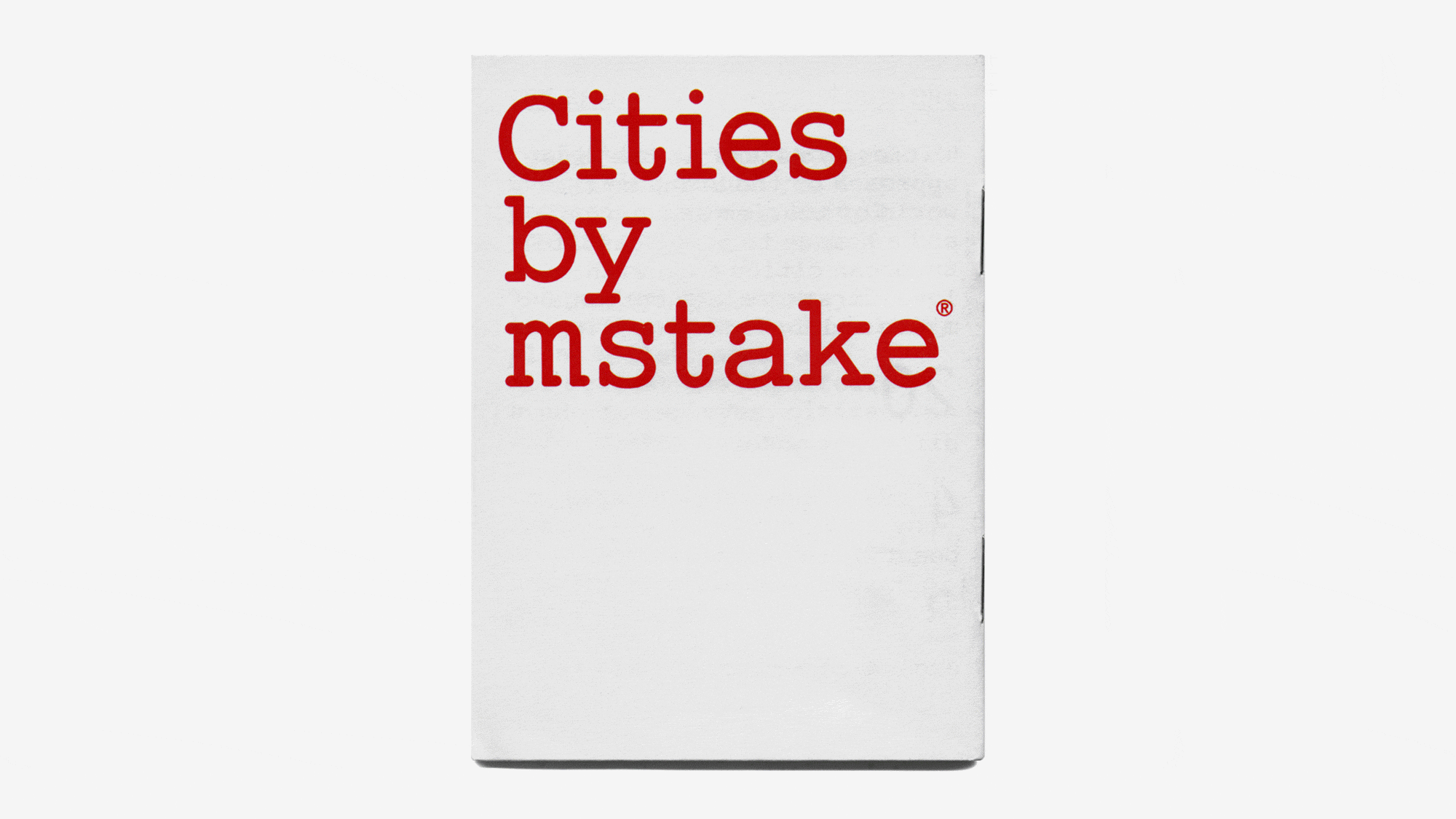
The Packaging
The pack for the Cities by Mstake special teeshirt series is actually a pizza box
The Print Campaign
Displays for showcases pay tribute to some inventions or discoveries made by mistake as microwaves, lysergic acid or post-it, while they make some misspelling
The pack for the Cities by Mstake special teeshirt series is actually a pizza box
The Print Campaign
Displays for showcases pay tribute to some inventions or discoveries made by mistake as microwaves, lysergic acid or post-it, while they make some misspelling


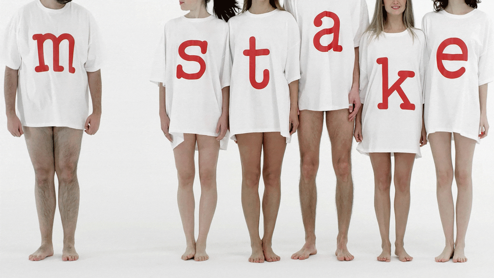
The Audiovisual Campaign
Four videos speaking on the brand through what is missing, explaining that the absent letter i from the name can be anywhere: looking at the sea, rowing in circles in a park, leaving a public bathroom or sitting on a bench watching how life goes by
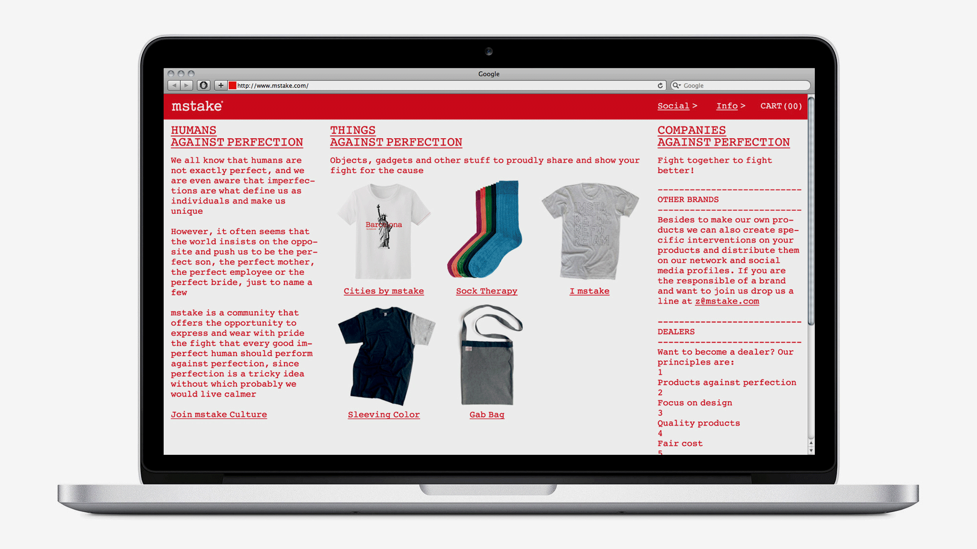
The Website
It has some spelling mistakes and three clearly different areas: community, shop and collaborations
Company
Filmmaking and production Jaume Jardí, programming Strabinarius and Seasons, printing Nova Era, client Albert Saurina from Mstake
Spacetime
Barcelona, 2014, 2016
Categories
Identity, Logo, Guidelines, Packaging, Communication, Campaign, Video, Web, Fashion, Commerce
Related
Vanguard Vintage
Tatiana Queiroz
Musa Bamba