
Corte de Reyes
Wine produced in Navarra especially for the US market, where people expect authenticity, sustainability and a certain tradition from a European product like this
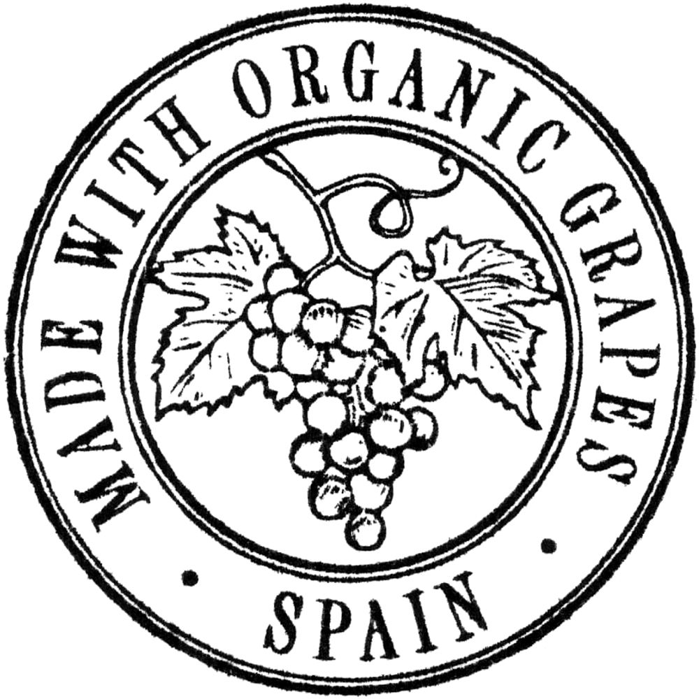
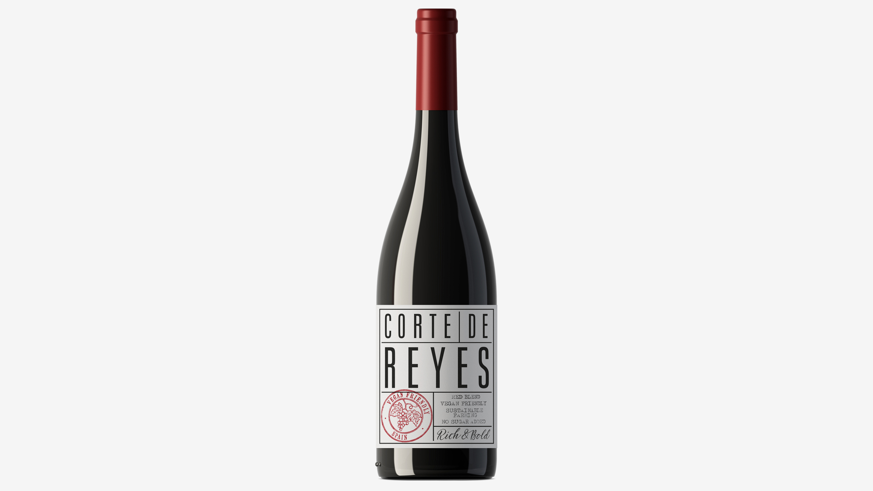
The identity has an artisanal elegance that comes from simplicity, not luxury, and is applied to the labels of the four varieties: Crianza, Tempranillo, Rosé and White. Graphic resources such as rubber stamps, typewritten texts or handwritten notes suggest that it is a short production made with care
Services
Design
![]()
![]()
Despite its apparent simplicity and besides these stamps that identify varieties by color and indicate the level of sustainability, the label contains a lot of information: a huge name-logo, some highlighted product characteristics and even a kind of slogan describing the wine in a marketing style
The identity has an artisanal elegance that comes from simplicity, not luxury, and is applied to the labels of the four varieties: Crianza, Tempranillo, Rosé and White. Graphic resources such as rubber stamps, typewritten texts or handwritten notes suggest that it is a short production made with care
Services
Design

Despite its apparent simplicity and besides these stamps that identify varieties by color and indicate the level of sustainability, the label contains a lot of information: a huge name-logo, some highlighted product characteristics and even a kind of slogan describing the wine in a marketing style

Company
Printing Gráficos de Oyón, client BO
Spacetime
Pamplona, 2023, 2024
Categories
Identity, Packaging, Food & Drinks, Commerce
Related
Martínez Corta
Palacio de Bornos
Printing Gráficos de Oyón, client BO
Spacetime
Pamplona, 2023, 2024
Categories
Identity, Packaging, Food & Drinks, Commerce
Related
Martínez Corta
Palacio de Bornos